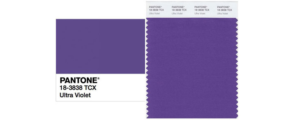
Purple is a divisive color. Most people either love it or hate it. Personally, I’m in the latter category, so I didn’t feel very excited or enthusiastic when Pantone announced that the color of the year for 2018 is Ultra Violet. But color is such a personal thing, and everyone responds to it differently.
So what’s the story behind the color of the year? Why does it matter? And who gave Pantone the authority to designate a color of the year?
When I worked in the fashion industry, our design team took meetings with various color forecasting services every season to see what they were offering. Each service presented different possible color palettes for each season, and we evaluated each company’s offerings with a healthy degree of skepticism and criticism. In the end we made our decisions based on which palettes fit the visual language of our company and the customer we were designing for: which colors were relatable, fresh, and sale-able for us, and which colors might help to make a collection more appealing. But when we purchased a (very expensive) palette from a color service, we never used the entire palette. We generally purchased the palette for one or two colors and for some of the imagery behind those colors, which helped to inspire a season and its colors.
So how much of color forecasting is accurate and useful? I’d argue that it’s quite arbitrary and not very literal at all. You might start to notice pink trending on-line and in stores, but often the shade of pink will vary from one brand to another. These days it’s rare for a single shade to trend. On the other hand, 20 years ago it was quite different, and a single shade of a color was much more common. Do you remember Gwenyth Paltrow’s Pepto Bismo-colored Ralph Lauren gown? That bubble gum pink color was absolutely everywhere that year, making it a very difficult time for me to work at Ralph Lauren. Unsurprisingly, I’m very particular about shades of pink, too.
As far as I can remember, Pantone’s color of the year has always been a little controversial. It’s a bit of a chicken vs. egg conundrum: is a color designated the color of the year because it’s already trending, or does that color become trendy because it’s declared the color of the year? The answer is probably a little of both.
But does any of it really matter? If you’re not a wearer of green you probably won’t be very excited to hear that Emerald was selected for 2013, or Turquoise in 2010. On the other hand, if you love green you’ll be thrilled because you might start to see more of it in stores. I, for one, won’t be wearing any more Ultra Violet than I did last year. (Which, for the record, was none.)
But how is a color selected to be the color of the year? More and more, like a lot of trend and color forecasting, the story isn’t necessarily about the color itself. Much of the hype has become about the concept or message behind the color. It’s about culture and cultural climate. In 2017 Greenery was a commentary on the environment and on new beginnings. This year the message is clearly political: red and blue join together to make purple. Given the divisive political climate in the United States right now, it feels a bit like wishful thinking since Republican (red) and Democrat (blue) states and points of view are extremely divided. Uniting them is a valid and honorable goal, even if it seems nearly impossible at present. But since politics is a hot topic right now, choosing purple as the color of the year helps to make the color of the year a topic of discussion, which in turn catches people’s attention. Which I’ve long suspected is the real goal of any color; it’s all about marketing and sparking conversations.
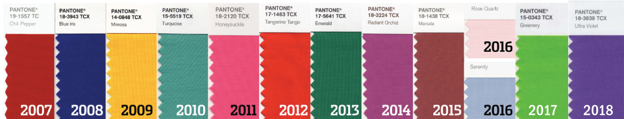
If you look back at previous colors of the year, it’s only been a few years since another shade of purple was chosen. The last time was 2014 with Radiant Orchid. So it doesn’t really feel like time for purple again quite yet. Does Pantone have more insight into color trends than anyone else, especially other trend forecasters? In short, no. They make excellent color specification tools that I use all the time in my work. But I wouldn’t say they have any special insight into color trends. They’ve just done a good job of marketing the concept and it helps them to sell their products, that’s all.
So is there really anything of value to the declaration that Ultra Violet is this year’s color? Well, chances are pretty good that you’ll see more of it, partly because Pantone has declared it to be and, as a result, some designers will follow suit. It will also be a color on your radar now, so you’ll notice it because you’re aware of it as a possible trend. And maybe the color really is trending a little bit right now.
Having said all that, it might surprise you that I selected a color really close to Radiant Orchid for one of our spring pattern covers, so even if it’s not a color I gravitate to for my own wardrobe I’m not completely adverse to it either. I just prefer less vibrant shades.
But what really matters in the end is, do you like it? Do you want to sew and wear Ultra Violet? That’s a decision that only you, the designer (and if you sew you are the designer!), can answer.
What’s your feeling about Ultra Violet?
(If you would like to read more about the history of Pantone and its purpose, look here and here. We use Pantone a lot, especially when working with our printers and whenever I design a fabric collection.)
It’s certainly the colour of waterproof jackets here in cold wet north west England. Both in the shops and the school playground. When I got my new purple coat my 4 year old complained he couldn’t see me as I now looked the same as all the other mums.
I hope cyan doesn’t become the summer lightweight waterproof colour as I picked one of those up in the sale.
Ha! Now that you mention it, S had a purple raincoat a few years ago. It’s a good color for rain gear, I think. Not too bright on a cloudy day, but a little cheery. I’ll keep my eye out for cyan!
The thing that jumped out at me while reading this post was the concept of purchasing a color palette. I don’t quite understand how a set of colors is something you pay for. I’d love to hear more! I love eggplant tones but ultraviolet isn’t my cup of tea either.
I wish I still had some of them. Each company had its own method of presentation, and my favorite was the glass test tubes filled with a different color yarn for each color in the palette. It’s more about the very specific color (subtle variations make a big difference) and the combination of colors. They can be very inspiring!
First of all I LOVE purple and this is my absolute favorite shade!
But very curious where you got your political explanation for the choice of color (red + blue to bring unity)? Did Pantone give that as there reason? When I initially saw the color, my first thought was of the now famous “When I am old I will wear purple” and the increase of aging baby boomers making up our society. I thought that’s what it was all about!
It’s good to hear from the purple lovers! Pantone does a conference call every year when they introduce the new color. In the presentation they explain their thinking and influences behind the color. You can read about it here: https://www.pantone.com/color-of-the-year-2018 and here: https://www.nytimes.com/2017/12/07/fashion/pantone-color-of-the-year-2018-ultraviolet.html
I think it’s all a little fun and tongue-in-cheek, but it certainly gets people talking!
I think they spin a big color wheel and go with whatever the pointer thingy lands on.
Oxblood was the color of the year in what, 2012 or thereabouts? Given that I’ve consistently worn that color since I was a wee little thing, I was amused to find that I was now at the height of fashion for one year.
Okay, in all seriousness: I don’t think the colors of the year–whether designated by Pantone or Sherwin-Williams or anyone else–in and of themselves influence purchasing so much as whether or not consumers feel comfortable living with those colors, whether on our bodies or in our homes.
Marsala, right? I LOVED that color!
And yes, I think you just made my point much more clearly than I did. Color is completely subjective.
Oxblood is a lovely colour and you’re lucky it’s normally available. This last year I’ve been madly stocking up on red – you wouldn’t think it would be so hard to find!
It’s true, and it’s one of the biggest challenges of sewing, I think. So, so often I go hunting for a particular color and can’t even find anything CLOSE to it. It’s one of the aspects for working for big design companies that I miss most: DTM = dyed to match. Such a luxury to be able to order any color you want….
I happened to be wearing an ultra-violet pashmina that my husband bought for me on a trip to India a few years ago (of course I just call it purple, lol). I like this color, and use it as an accent to all of the black I love to wear. My daughters definitely love it. It’s a nice alternative to the ubiquitous pink for girls.
See? I love to hear different people’s perspective on color. I’ve never gravitated to it but have plenty of friends who do. I wonder how much of it has to do with your geographic location? Different colors look better in different types of light, and I find myself liking different colors in Spain than I did in NYC.
We’re Minnesotan and our granddaughter’s name is Violet, so it’s a given that I’ll be looking for the color. : )
Violet is a great name! And I always think of Minnesota when I think of purple, maybe because of Prince.
Purple is and has always been my favorite color-almost any shade of it!! Do I wear a lot of clothes in that color? No. But just seeing purple usually makes me happy!!
That’s really interesting that you love it but don’t wear much of it! To me, so much of it is the particular shade of the color, too. Radiant orchid is much more wearable to me that Ultra Violet. It could have something to do with skin tones too?
One of the women who is in charge of choosing the Pantone color of the year lives nearby on Bainbridge Island. The local TV magazine show did a segment on her which was really interesting. She was completely dressed in ultra violet.
I love that! It sounds like a fun job, for sure. I had a friend at Ralph Laurent and then at Tommy Hilfiger who managed the color library. Fascinating!
Great! Finally, I’ll be trending!
Ha! I love that. I’m waiting for sea foam green to come back. But it never goes out of style for me…
Being from Minnesota, I see that color purple all the time, since it is the color of our football team, the Vikings. I would never consider that color for anything else to wear, except a football jersey!
I lived in Spain for a year after college and had a blast! So fun to hear of your experiences!
I couldn’t wear green for the longest time, almost certainly because my cheerleading uniform was green and white. Color associations can be strong!
Purples look good on me, so I tend to gravitate toward them. However I notice that once they are in my closet, I don’t seem to pull them out to wear often. A nice idea is using the selected color of the year in accessories. Not as much of an investment, and the bold colors will work well with any neutral. I do follow what Pantone selects, but I don’t build a wardrobe around it.
Absolutely! An accent color works great for accessories, no question. I do the same thing in our house: mostly neutral with pops of color that can be changed out easily.
I love this year’s color – lilac and violet purples always cheer me up when I see them, maybe it’s a reminder of spring.
Maybe I need to change my purple association to lilacs and spring flowers and it will change my perspective on the color! I like your association much better!
I am wearing ultra violet! I love it as an accent colour. I have necklaces, a scarf and a cardigan in this colour. I once had an ultra violet bikini too. It really suits my colouring so I am a fan.
I grew up in Italy where it’s considered bad luck to wear purple. It’s a liturgical colour worn by priests during advent. It’s associated with royalty too. There’s a lot to like (or dislike!) about this colour.
That’s really interesting, Liz! And it’s great that now you like it.
“But when we purchased a (very expensive) palette from a color service, we never used the entire palette.” This is fascinating. A palette is proprietary?
It’s the specific shades of the colors and the way they’re put together that the trend companies are selling. It’s hard to explain and probably sounds really weird, but often when you find a very particular shade of a color is can inspire an entire collection. I’ve carried around little swatches before, just because I love that very precise shade. I wish I still had some of the color forecasting presentations I could show you!
I’ve read that Miranda Priestly’s speech about color in The Devil Wears Prada isn’t accurate. Thoughts?
” This… stuff’? Oh. Okay. I see. You think this has nothing to do with you. You go to your closet and you select… I don’t know… that lumpy blue sweater, for instance because you’re trying to tell the world that you take yourself too seriously to care about what you put on your back. But what you don’t know is that that sweater is not just blue, it’s not turquoise. It’s not lapis. It’s actually cerulean. And you’re also blithely unaware of the fact that in 2002, Oscar de la Renta did a collection of cerulean gowns. And then I think it was Yves Saint Laurent… wasn’t it who showed cerulean military jackets? I think we need a jacket here. And then cerulean quickly showed up in the collections of eight different designers. And then it, uh, filtered down through the department stores and then trickled on down into some tragic Casual Corner where you, no doubt, fished it out of some clearance bin. However, that blue represents millions of dollars and countless jobs and it’s sort of comical how you think that you’ve made a choice that exempts you from the fashion industry when, in fact, you’re wearing the sweater that was selected for you by the people in this room from a pile of stuff.”
To a certain degree it might still be accurate, but these days we’re all much more individual. I would liken it to when particular skirt lengths were trendy. Nowadays, any skirt length goes and you wear what looks best on you or what you’re most comfortable with. Color inspiration can come from anywhere, not just from the top down. Trends can start on the street just as much as from a high-end designer.
I thought of that too and agree (if that’s what you’re saying): couture trickle-down is real, and Lagerfeld et al. are more likely to consult the zodiac than Pantone’s picks. I saw pops of cadmium yellow on the runway recently, just as (the now hackneyed) mustard showed up a few seasons back.
Yep. And I still love mustard.
Talking to friends, we all thought purple was much darker when we were growing up! The regal robes in fairy stories was our reference point. As you say variations pop up, and hopefully some deeper blue-purples will appear this year, or better still that rare creature, really deep violet – much easier to wear when your colouring is on the cool side.
More like eggplant, right? I believe I tended to think like your friends, growing up, too.
Liesl, dear, you sound a bit whiny in this blog. Gwyneth’s dress was not “Pepto Bismo(sic)” colored—it was a very pretty pale pink. And i am quite fond of the Ultra Violet, FYI.
Tanya, it certainly wasn’t my intention to offend, and I apologize if I did so. Like I said at the start, color is VERY subjective. I have certain associations with particular colors and I’m sure they’re completely different from yours. I’m merely making the point that we should all wear what we like, not what’s trending.
Liesl—no apology needed. Must not have had my coffee yet…..
“Whiney” “ultraviolet” “[sic]”
Frances—I stand corrected on the “whiney”. However, Pantone calls the color Ultra Violet…..
Frances and Tanya, I think we should call it “wine-y” since we’re talking about color anyway…
Liesl: sounds good!
Oh I am all OVER the wine-y colours! 🙂 Claret, marsala…. All those deep Bordeaux reds. I can drink them and wear them very happily!
I love the Radiant Orchid, not so much the Ultra Violet. But I could maybe see it as a one piece swimsuit!
Swimsuit, yes! That sounds really pretty. (But probably better on someone with a different skin tone than me, that’s for sure…)
https://www.bloomberg.com/graphics/2018-death-of-clothing/ This pretty much reflects what I see. No one has to dress up for work anymore, except bankers and lawyers, so everyone’s buying less clothing, and brands aren’t staking bets on a single trend, so styles haven’t changed that much (less incentive to buy), and seasonal/celeb-driven ‘must-haves’ are covered by oh so many knock-off brands.
Ooh, thanks for the link! I just gave it a quick scan and will read it more thoroughly when I have time later today. It looks, at first glance, a lot like Li Edelkoort’s fashion manifesto from a few years ago. And I completely agree, if that’s the case. https://www.dezeen.com/2015/03/02/li-edelkoort-manifesto-anti-fashion-obsolete/
Let us know how you did on the Espanol past perfect. I’m sure you kicked butt! On to the subjunctive future!
Frances, cross your fingers for me! Test was moved up to this Thursday and I’m still tackling all those challenging verb tenses. Not to mention the le, la, lo, se…
I love this year’s colour! It’s funny though…My mother HATED purple and I grew up thinking it was a ‘bad’ colour. As a young adult, I realized…wait a minute! How is a colour bad? Purple is now a favourite of mine. But when my mom turned 60, one of her friends threw her a birthday party and it turned out to be a purple party. Everyone wore purple and brought a purple gift. I’m not sure she ever recovered!
Oh, the women with purple dresses and red hats? I forget the name of that group. That’s one I’ll just never be able to join. Unless I somehow radically change my color associations, anyway.
I had a very successful color consulting business back in the 80’s when it was all the “rage.” I strongly believe that color definitely affects how people look…healthy, vibrant, sickly, fatigued, etc. I don’t follow “trends” but choose colors that I think look better on me than not. Color is the only thing we get “free” when we make a purchase and I try to get one of my “better” colors close to my face…especially when I’m purchasing fabric and yarn because of all the hours I’ll invest in the making of a garment. And to answer your question…I personally have never been a “purple lover.” I guess that’s why we have chocolate and vanilla! 🙂
Oh, how fun! I absolutely love color and everything it does for us. My aunt “did my colors” when I was in high school, but I’ll never be a “jewel” colored girl even if they look best on me. Although the black and white certainly stuck…
Would love to hear more about your experiences in the field! Would you be interested in writing a post for use sometime? I think it would be fun to hear about it from your perspective.
How timely, I just watched a fascinating episode of an Australian science show: Catalyst, that was all about algorithms and computer modelling. One of the subjects they spoke to was a fashion designer who had purchased, not a colour palette, but a software program that could “predict” colour palettes. He personally didn’t like the colours the algorithm gave him (a pastel purple featured!) but he went with it and had a really good selling line that year.
Interesting to see the last decades colours in a row like that. They all look so bright to me, but then I’ve spent more than a decade in variations of brown/beige!
It’s interesting to hear about Pantone’s color of the year, and the whole color palette field, as I find color preferences and study fascinating. I have quite strong views on color and could probably discuss it all day, ha! Personally, I love many purple shades as they occur in nature, lilac and hydrangea, especially. But for clothing and home furnishings, I am not so loving. I like an eggplant or plum, and sometimes something along the lines of Radiant Orchid, but that’s all. I want to like certain lavenders but they really don’t go well with my skin and hair colors. Fortunately there are plenty of other colors to choose from!
To me ultra violet is such an unnatural shade of purple. I’m sure there are a few naturally-colored flowers that shade, but I think a softer lavender or a deeper purple would be a more natural (and easier to wear!) color.
I’m always fascinated by the ‘colors of the year’, especially since different companies come out with different ones each year. For Sherwin Williams it’s Oceanside (a bright blue), for Kona cotton it’s Tiger Lily (a bright orange), and Benjamin Moore has Caliente. So I guess in 2018 I’ll be wearing bright purple, living in a bright blue and red house, making quilts that are bright orange?? Lol.
This was really interesting and I enjoyed reading the post as well as all the comments!
I love purple, but it is hard to find in fabrics. At least in adult appropriate fabrics. So I love the color of the year if it means better purple fabric options. When I was at Mill Ends in Portland the employees were saying the ultra violet bolts were really popular. Not my favorite shade of purple though.