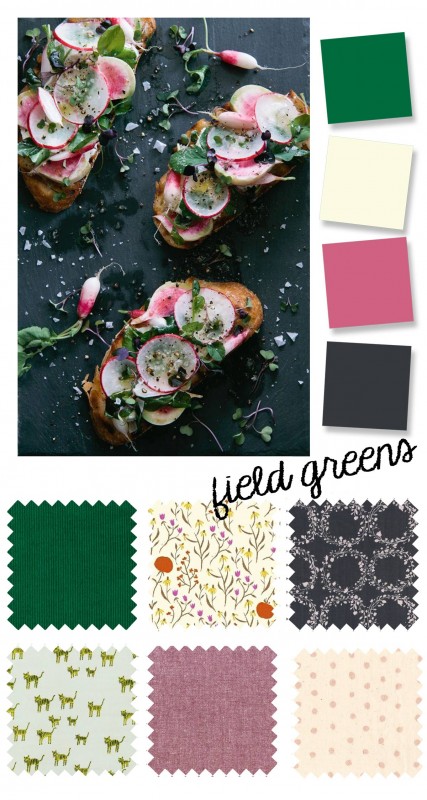
Ah, late summer/early fall. It still looks like summer outside, but the mornings and evenings are getting chillier (at least where I live). This photo seemed to sum up this transition time for me . We still have fresh summer veggies on the vine, but the colors around are getting richer, and I’m starting to think of warmer clothes.
 photo source: once wed
fabrics: corduroy, clover, charcoal, tigers, chambray, metallic polka dot
The deep emeralds and rosy pinks are balanced by light and airy prints, and the palette is anchored by a deep charcoal (gray is a gentler alternative to black, easy to wear and so versatile). I’ve included a mix of fabric substrates (corduroy, double gauze, chambray, quilting cotton) and tones. I think the girlier prints would lend themselves nicely to a Playtime Tunic or Hide-and-Seek Dress with contrast yoke. (I made one in the eggplant chambray here last spring, and my daughter wears it often.)
For boys, I’d love to see a casual corduroy version of the Art Museum Trousers with a tiger Sketchbook Shirt! Who else is ready for some early fall sewing?
I love this palette. Perfect for autumn without being brown/orangy.
I think this is my favorite color palette yet. Crushing on that corduroy…thinking it would be great made into a pair of After School pants – with the ruffles!