If you follow Oliver + S on Facebook, you’ve already seen photos of our booth from Quilt Market. I thought it might be fun to tell you how the booth came together this time.
We’ve always done a small booth with canvas curtains for walls, mostly because we don’t have the space to store a big, hard-sided booth in our little Brooklyn studio space. We also don’t have much interest in driving a truck full of materials all the way across the country twice a year, so we pack the booth onto a pallet and have a trucking service transport it for us.
But this year we wanted to try a larger booth and thought it was time to do something a little different than we usually do.
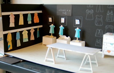
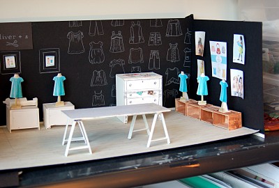
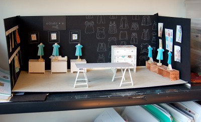
I’ve been wanting to do a chalkboard theme for quite a while now, and Oilcloth International makes the coolest chalkboard oilcloth. Our studio space is not much larger than the size of the larger booth we were planning to do. Since we weren’t able to actually assemble the booth before the show, I mocked up a tiny model booth on this theme. I thought we could make new curtain walls using the oilcloth and draw all over them, just for fun. I mentioned this idea to Lissa, Moda’s Marketing Director, and she sent us a giant box of chalkboard oilcloth drapes and floor coverings from a show they had done a while ago. For their booth, instead of actually using chalk, Moda had painted on the oilcloth to look like chalk so it wouldn’t rub off during transport and handling. The paint really looked like chalk, and I loved the effect of the black and white.
I sent some photos of my miniature booth to Brooke and asked her opinion. She was a little bit afraid that the booth would look too dark with black walls and asked if there wasn’t some way we could do the chalkboard theme with our usual Oliver + S turquoise color. But since there’s no such thing as turquoise-colored oilcloth, I didn’t think this would work.
Then one day, while I was still contemplating the wall dilemma, our friend and studio neighbor Kevork (Kevork is a painter, and his daughter modeled the red riding hood cape in Little Things to Sew) was hanging out in our studio and asked about my little model booth. I explained what I wanted to do and where we were having problems, and he said, “Why don’t you stretch canvases for your walls, like I do with my paintings?” This would allow us to break down the walls for shipping and for storage, and we could paint the canvases any color we wanted. And it would look a lot like a booth with hard walls. We were intrigued.
But we wondered about whether we could draw with chalk on the walls. He took us down to his studio where he had a work in progress on the easel. He told us that if you use acrylic paint, you can do exactly what we wanted. To demonstrate, he took a piece of chalk and started drawing on the top of his painting! Then he took a spray bottle of water, sprayed the surface of the painting, and started scrubbing it with a cloth to remove the chalk. Todd (if you don’t know) works with the Whitney Museum of Art, and he has been well trained that you never touch the artwork. To see someone do this to a painting almost gave him a heart attack.
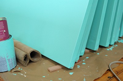
We did a lot of research and a few trial runs before deciding it would work. So the week of S’s spring break, we stretched eight giant (8-foot high!) canvases, painted them, took them apart, and packed everything up to ship to the show.
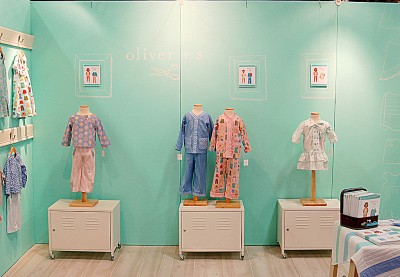
Once we arrived at the show, all the canvases needed to be re-stretched so the canvas was very tight, and then we bolted the stretcher bars together to make the walls of the booth. We kept the booth very clean and simple, and Moda lent us the dresser and vintage school chairs for our display.
Then I got busy drawing! It was fun to draw the logos and the free-hand clothing, modeled after many Oliver + S styles. The chalk showed up well on the walls but didn’t distract from the clean, spare look we prefer for our booth. It’s a little difficult to see the chalk in these photos, I’m afraid, but if you click on a photo it will enlarge so you can get a better look.
The walls can even be washed, so when we were finished with the show I simply took a damp sponge and wiped all the chalk off the canvas. We’ll use these walls again for future shows, and I can draw something on them with chalk or just leave them plain. For now, we’ve rolled them up and tucked them away in the studio where they take up very little space. Problem solved, with a little help from our friends.
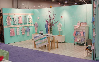
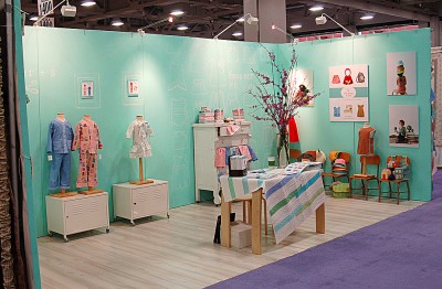
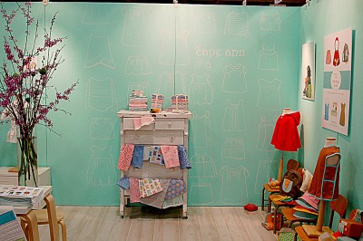
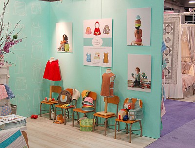
Liesl, I love it!! The school chairs with the chalk theme is adorable, and I love how you integrated the pattern line with the book projects. It all looks so fresh!
It turned out so great! (And I do think the blue looks much brighter than the original black.) Your drawings look fantastic. How did you not come home with a big first place ribbon!
What a fun story. Then end result was well worth the research and work!
That’s incredible, every single bit! Thanks for sharing!
a) The mock-up is totally adorable,
b) friends and neighbors are the coolest,
c) I am picturing the little illustrated guy in boxer shorts from Heather Ross’ blog having a heart attack over the chalk marks.
Great story.
Goodness,that colour is similar to my sewing room!(Which I painted 2 years before I found your patterns)that must mean something!
So interesting! Thanks for sharing the details — it’s fascinating to discover the process behind your booth. And oh, what I wouldn’t give for the little model booth! How cute is that?
ingenious! Wow – i’m so impressed with that neat idea.
And the mockup is the cutest little thing ever…. it’s like a smidgen dollhouse 🙂
Love your booth…and got to wondering about those cute new patterns! As always, love everything you dream up!
I love that your booth is clean & uncluttered. Can’t wait to see more of Cape Ann & those cute new patterns. As always, love everything you make
This post made me smile. You did a wonderful job!
Brilliant problem solving! There were a couple of new designs I noticed in a close up shot of the Cape Ann fabric design with the little clothes drawn on it – future patterns maybe??
But they didn’t seem to be those from your next release – so I am intrigued!
That booth is just adorable!! Light and fun and perfect for your company.
And I’m DYING over the new pajama pattern – SOOO CUTE!!! Can’t wait to buy it when it’s released.
Lastly, here is my unabashed plea for more little boy patterns. We just found out for sure that I’m having a boy and I already own the complete O+S collection for boys, but would love some new stuff, too. Just wanted to throw that out there. Thanks! 🙂
This is so cool! I love reading about quilt market and how it works. Your booth is gorgeous!
Booth looks terrific! Sorry I wasn’t there to see it (and you!)
Your booth is lovely! Both the miniature mock up and the end results. All your work is completely perfect. Thankyou for sharing!
Okay, I was totally fooled by the first picture and didn’t realize it was a model! So cool! I love your final booth…and I am in awe of how well the chalk drawings of the patterns came out! 🙂
Love your booth! I am so excited about the new PJ pattern I see. Is that coming out in the next pattern release? August? I have fabric lined up and waiting:) Just wanted to see how long it would be to wait for. I find it very difficult to sew with any other patterns now, after sewing with Oliver&S patterns. I am addicted! Thank you for sharing your talent with us!
It was brilliant! beautiful and stood out in that vast sea of booths. I also love the black in your mockups – looks like chalkboard and a classroom 🙂
I think that I would have liked the black, too!