Regarding our last post about the principles of fabric selection, one commenter asked an excellent question:
“In all of the examples you’ve chosen, the solid is at the top and the print is on the bottom. Do you think it’s necessary to separate the print from the face with a solid, or can it work with the print on the bodice and a solid skirt?”
I think the placement of the print and solid can absolutely be reversed. Here are two examples of samples we’ve made in which the pattern is on top and the solid is on the bottom.

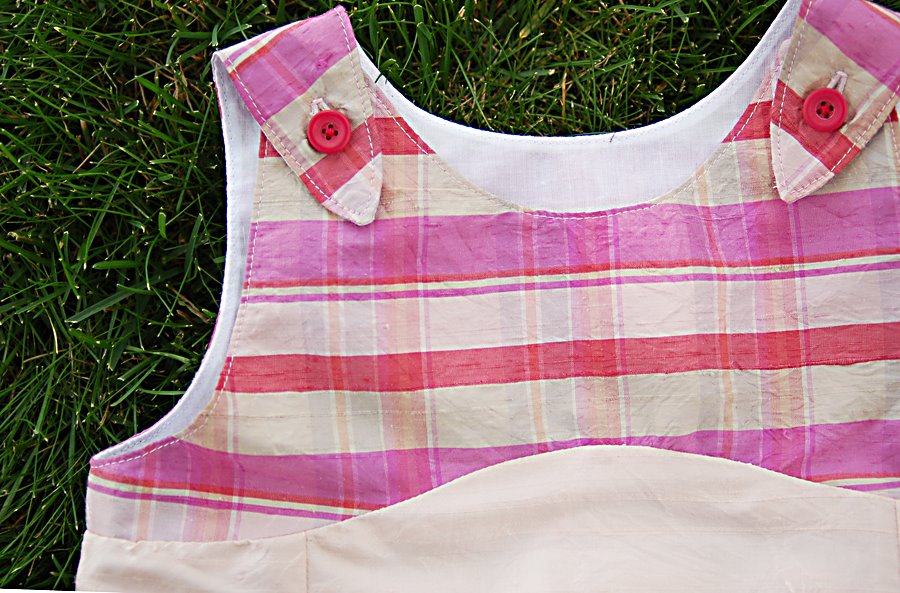
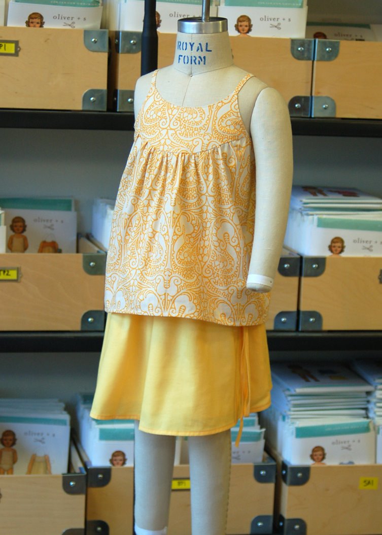
I think it’s really a matter of balance. A very busy print might not feel right up close to the face, especially in a large area. But a tonal or softer print would certainly be fine.
Proportion of a garment or outfit can also play heavily into your choice of where to use a print, too. For example, the Puppet Show Tunic and the Tea Party Sundress both have yokes with an empire waist (fashion trivia: yes, it really is pronounced om-peer), where the smaller area at the yoke might work nicely with a busy or oversized print and the rest of the garment either solid or a softer tonal print.
I’ll have an example of this for you shortly; I’m taking a project along on our Vermont sewing workshop this weekend and will show it to you shortly after I return. See you next week!
Thanks for answering my question, Liesl. I really appreciate the visual examples to illustrate the principles.