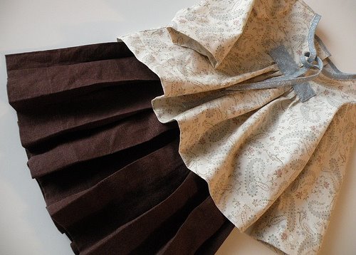
This 2 + 2 blouse and pleated skirt is understated and tremendously elegant while still wholly appropriate for a child.
If you had run across these fabrics at your local quilt shop, would you have thought “children’s clothing” when you saw them? Probably not. But didn’t this outfit turn out great? I like how Hannah, the seamstress, chose a subdued, muted color palette for the outfit. She has been very subtle in her use of color. The grayish-bluish colors in the 2 + 2 blouse, offset on the cream-colored background, are very understated. And the combination of that rich brown for the skirt might be an unexpected choice, but I love how the ensemble comes together. It’s very restrained in its use of color (the whole outfit is playing with a number of neutral tones), but in this case I think it works well with the lines of the design. Together the skirt and the blouse are elegant. They are sophisticated. And they definitely allow you to see the child before the outfit.
People sometimes don’t realize that it’s OK to be a bit restrained when it comes to using color for children’s clothing. Sometimes just a little pop of color is all an outfit needs.
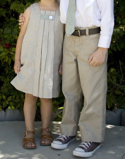
Birthday Party Dress sewn by our own Brooke Reynolds as an Easter dress for her daughter (love that matching tie for her son!).
This Birthday Party Dress has been made in a plain, neutral linen—with just a delicate wisp of color added thanks to the Liberty print used for the tab. This, too, is a bit unexpected. I love the choice of natural linen for the dress, and the addition of the print takes a plain fabric and turns it into something elegant. People tend to think that a dress for a little girl needs to be made from a busy, floral print. This dress turns that assumption on its head, using a tiny floral print in just a wee dose, and it works especially well.
But just because I’ve highlighted a couple very understated outfits doesn’t mean that everything needs to be very reserved and reliant on muted colors.
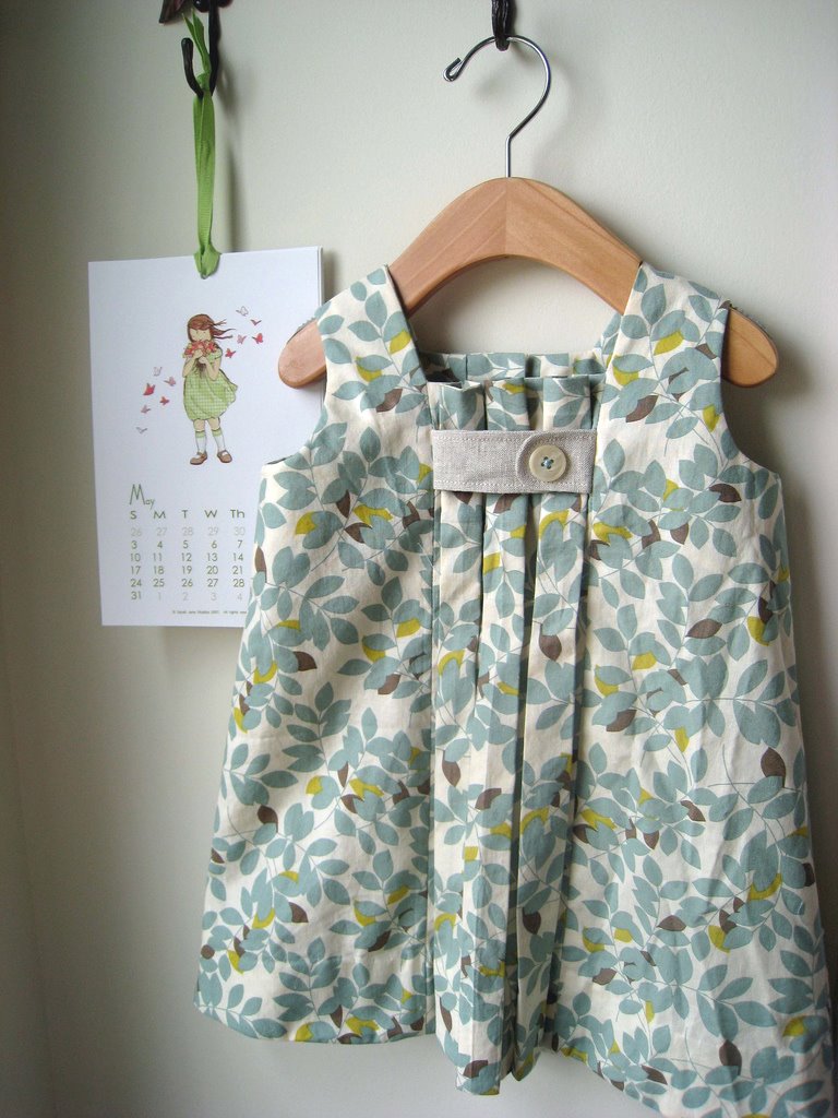 This Birthday Party Dress looks cool and ready for summer in a calm, relaxed palette of greens.
Here’s a dress that in some respects is the mirror opposite of the last one I highlighted. This Birthday Party Dress uses a floral print for the body and a linen for the tab. The print is busier than the others I’ve highlighted so far, but it’s still somewhat modest in comparison to many fabrics on the market today. It’s almost monochromatic with the different tones of green on a white background, but the lightest shade of green—which verges on yellow—steps out from the background a bit to give the dress a little visual interest. The fabric, while reserved and understated, is perfectly appropriate for a child’s garment and actually gives the finished piece an air of sophistication that you don’t find in most ready-made clothing for children. It feels cool and summery, doesn’t it?
Now please don’t infer from what I’m saying here that you need to be afraid of color. You can use very vibrant colors. You just need to select and balance your colors carefully.
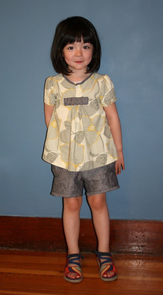 Bright yellow is toned down with neutrals for a large (but not overpowering) print in this 2 + 2 blouse with Puppet Show shorts.
I really love this combination. For this outfit, the sewer has combined the Puppet Show short with the 2 + 2 top. For the shorts she’s used a gray denim, and she has played this very effectively off the Amy Butler print she’s selected for the top. The gray of the print subtly picks up the gray of the denim (which is repeated in the patch at center front), but these neutrals are really there to serve as a base for the yellow in the print that subtly steps to the fore. The outfit, again, is elegant and mature (not juvenile at all), but it’s wholly appropriate for a child.
Here’s another piece sewn by the same sewer that uses even more color.
 Even bright colors can be subtle and elegant, as you can see with this Birthday Party Dress.
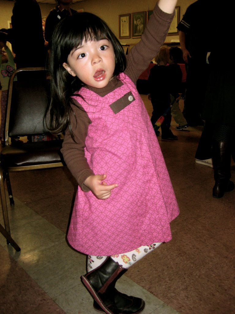
You have noticed here, haven’t you, that we’ve moved away from neutrals and have landed solidly in the land of pink? (No matter how much we try to mitigate against it at home, there’s a certain four-year-old there who just has to have her pink dresses….) But a bright pink fabric—bright enough to make any pink-loving little girl happy—can still be turned into a sophisticated and understated dress if it’s selected and balanced correctly.
Note that although this dress is very pink, it’s not a busy-print pink. There aren’t flowers and six other colors in the print. The print is a vibrant color, but it’s grounded nicely by the simple geometric pattern laid onto the bright base, by the matching solid brown tab, and by the brown shirt layered under the dress. This is a perfect example of how it’s possible to use very vibrant colors and still create an outfit that’s somewhat understated and that ensures you’ll see the child before the dress.
There’s a l
ittle secret I have that helps me pick the more reserved, and often more sophisticated, prints that appear in quilt shops each season. I tend to avoid the central prints in most designers’ collections. But that’s the topic of the next post in the series. So stay tuned.
Please, oh please, post more comments on this topic. I have been waiting for a post like this for nearly a year!
Merci!
Susannah
Thanks again for this piece of advice. I had already spotted the birthay dress with greenish floral print + linen for the tab. I liked it very much not knowing exactly why. now i know ;o)
I have really, really liked this topic and I, too, had picked out those two garments with loveliness in mind (the linen Birthday Dress and reverse, floral printed one).
I am losing my opinion as SweetPea grows older… she loves girly-girly prints and frills.
What do you do? Are you teaching your little one fabric and fashion concepts (on a child scale, of course) so she can learn to see what you see? I am being genuine as I ask this.
thank you for this series of posts. illuminating & helpful. have been looking forward to your posts to see what you have to say next! thank you again.
awesome advice! I am a bit of a wild child, so I do love pops of color and pattern, but usually limit it to an accessory, or a skirt, then paired with a very simple top, this same concept works well with my daughter who also (shockingly) loves to dress a bit crazily!
Again, thank you for this series. I love all the examples, but I too adore the first outfit in the neutral colors. However it is nice to see a pink example, because as much as I try to influence her my 3 year old knows what she likes.
I am really enjoying this topic as well and wholeheartedly agree! Although my four year old loves pink too so I made her Easter outfit using the Birthday Party Dress pattern in pink silk dupioni as well as the bow and it turned out very elegant without being too fussy (I sent the picture into the flickr group).
Thank you so much…looking forward to the next topic in the series!!
Thankyou Thankyou I have loved (as always) reading your posts they are always so helpful!
I love both a classic look and a vibrant outfit also this topic discussion has reminded me I need to go the simple understated look more often
charming outfits in this post!
Thankyou Thankyou I have loved (as always) reading your posts they are always so helpful!
I love both a classic look and a vibrant outfit also this topic discussion has reminded me I need to go the simple understated look more often
charming outfits in this post!
this is awesome advice…I usually have to ask the ladies at the quilt shop about the sizes of prints and the ratio of print sizes per pattern…I admit I get a little too crazy in my print selection and my dd's clothes reflect that. I can't wait to be more refined…really…;)