

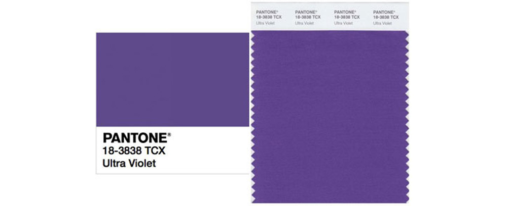
Purple is a divisive color. Most people either love it or hate it. Personally, I’m in the latter category, so I didn’t feel very excited or enthusiastic when Pantone announced that the color of the year for 2018 is Ultra Violet. But color is such a personal thing, and everyone responds to it differently.
So what’s the story behind the color of the year? Why does it matter? And who gave Pantone the authority to designate a color of the year?
When I worked in the fashion industry, our design team took meetings with various color forecasting services every season to see what they were offering. Each service presented different possible color palettes for each season, and we evaluated each company’s offerings with a healthy degree of skepticism and criticism. In the end we made our decisions based on which palettes fit the visual language of our company and the customer we were designing for: which colors were relatable, fresh, and sale-able for us, and which colors might help to make a collection more appealing. But when we purchased a (very expensive) palette from a color service, we never used the entire palette. We generally purchased the palette for one or two colors and for some of the imagery behind those colors, which helped to inspire a season and its colors.
So how much of color forecasting is accurate and useful? I’d argue that it’s quite arbitrary and not very literal at all. You might start to notice pink trending on-line and in stores, but often the shade of pink will vary from one brand to another. These days it’s rare for a single shade to trend. On the other hand, 20 years ago it was quite different, and a single shade of a color was much more common. Do you remember Gwenyth Paltrow’s Pepto Bismo-colored Ralph Lauren gown? That bubble gum pink color was absolutely everywhere that year, making it a very difficult time for me to work at Ralph Lauren. Unsurprisingly, I’m very particular about shades of pink, too.
As far as I can remember, Pantone’s color of the year has always been a little controversial. It’s a bit of a chicken vs. egg conundrum: is a color designated the color of the year because it’s already trending, or does that color become trendy because it’s declared the color of the year? The answer is probably a little of both.
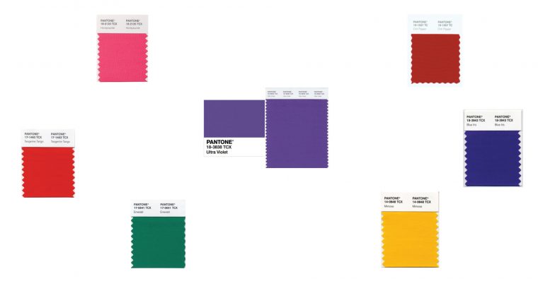
But does any of it really matter? If you’re not a wearer of green you probably won’t be very excited to hear that Emerald was selected for 2013, or Turquoise in 2010. On the other hand, if you love green you’ll be thrilled because you might start to see more of it in stores. I, for one, won’t be wearing any more Ultra Violet than I did last year. (Which, for the record, was none.)
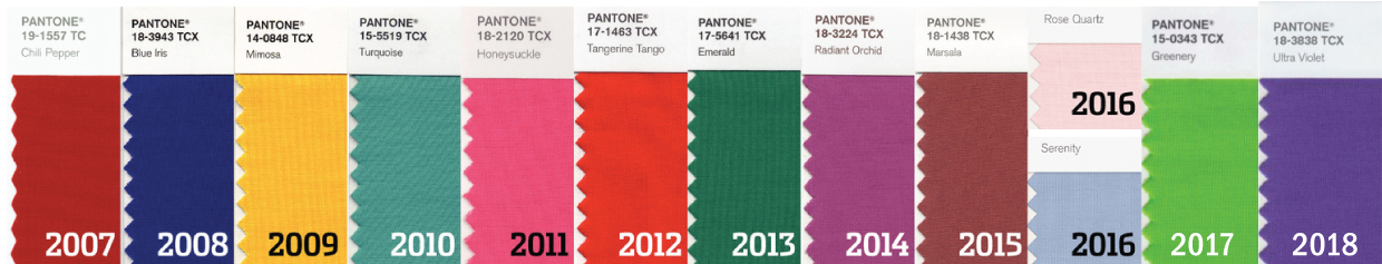
But how is a color selected to be the color of the year? More and more, like a lot of trend and color forecasting, the story isn’t necessarily about the color itself. Much of the hype has become about the concept or message behind the color. It’s about culture and cultural climate. In 2017 Greenery was a commentary on the environment and on new beginnings. This year the message is clearly political: red and blue join together to make purple. Given the divisive political climate in the United States right now, it feels a bit like wishful thinking since Republican (red) and Democrat (blue) states and points of view are extremely divided. Uniting them is a valid and honorable goal, even if it seems nearly impossible at present. But since politics is a hot topic right now, choosing purple as the color of the year helps to make the color of the year a topic of discussion, which in turn catches people’s attention. Which I’ve long suspected is the real goal of any color; it’s all about marketing and sparking conversations.
If you look back at previous colors of the year, it’s only been a few years since another shade of purple was chosen. The last time was 2014 with Radiant Orchid. So it doesn’t really feel like time for purple again quite yet. Does Pantone have more insight into color trends than anyone else, especially other trend forecasters? In short, no. They make excellent color specification tools that I use all the time in my work. But I wouldn’t say they have any special insight into color trends. They’ve just done a good job of marketing the concept and it helps them to sell their products, that’s all.
So is there really anything of value to the declaration that Ultra Violet is this year’s color? Well, chances are pretty good that you’ll see more of it, partly because Pantone has declared it to be and, as a result, some designers will follow suit. It will also be a color on your radar now, so you’ll notice it because you’re aware of it as a possible trend. And maybe the color really is trending a little bit right now.
Having said all that, it might surprise you that I selected a color really close to Radiant Orchid for one of our spring pattern covers, so even if it’s not a color I gravitate to for my own wardrobe I’m not completely adverse to it either. I just prefer less vibrant shades.
But what really matters in the end is, do you like it? Do you want to sew and wear Ultra Violet? That’s a decision that only you, the designer (and if you sew you are the designer!), can answer.
What’s your feeling about Ultra Violet?
(If you would like to read more about the history of Pantone and its purpose, look here and here. We use Pantone a lot, especially when working with our printers and whenever I design a fabric collection.)