I’m a tearsheet fanatic. I’ve always loved pulling and archiving tearsheets. But it wasn’t until I got to design school that I learned I wasn’t the only one saving random pages I tore from magazines and, in fact, that those pages could become part of the design process.
Unfortunately, S caught onto this habit really quickly and now looks over my shoulder when I read a magazine to holler out when she sees something she wants to save. Sometimes I have to explain that we’re not removing pages from a particular magazine. (Marie Claire Idees and Martha Stewart Living are the only survivers on my save-the-entire-magazine list. The others have, sadly, gone out of print: Blueprint, Domino.) Most of the time she gets to keep all photos of dogs and girls wearing pink.
I’ve appropriated a portion of one wall in the studio to act as my inspiration board, and on it are taped a variety of tearsheets and other objects that I like to see on a regular basis. Some of the images and objects have been inspiring me for years. Others get swapped out when I grow tired of them or find something else that interests me more.
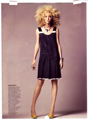
This one has been on the wall for quite a while. It’s a Prada dress that I adore and wouldn’t mind wearing, myself.
I came back to this tearsheet one day recently when I was preparing to sew S’s Easter dress. I had selected navy silk dupioni (from Brewer) for the dress, and then I found a wonderful vintage yellow grosgrain ribbon with a moire effect (from Tinsel Trading). I wanted to incorporate some yellow eyelet fabric that I’ve been saving for a while, but I was having trouble pulling it all together until I remembered that tearsheet I walk past every day.
Off came the photo from the wall, and I carried it around for the next few days so I could think about it more. Here is what ultimately came of it: my interpretation of the feel of that Prada dress, done for a little girl.
In the end, I decided on two important embellishments to the Birthday Party Dress inspired by the photo. I added yellow topstitching in a deliberately meandering manner so that it would look uneven and a little “messed up.” And I sewed a strip of the eyelet fabric to the top edge of the hem facing so that it looks like a contemporary version of a petticoat peeking out from under the dress. It was important to me that the eyelet be separated from the hem to the extent that it had some dimension rather than simply looking like lace applied to the hem. By sewing the eyelet to the top of the hem facing it looks like a separate layer worn under the dress. Then I carefully (but not too carefully, since I wanted it to look a little rough) trimmed the eyelet into scallops that peek out beneath the dress.
And here is the dress, being modeled. I have to tell you that if my job consisted of regularly cajoling S to pose for photos I think I’d quit. It’s such a relief to work with an illustrator who does his work without whining or refusing to stand still/remove his cardigan for just two photos/stop making goofy faces/etc. (Dan, do you do any of those things when I can’t see you?)
I’m happy with the finished dress, and S loves it. Which is what counts. But she still won’t pose properly for me.

