Next time I do a series of principles like this, remind me to list fewer principles! I feel like we’ve already addressed this principle in the course of covering some of the others, so I’ll make this a quick post.
As I’ve mentioned before, I really like the refreshing look of tonal and two-color prints right now. They’re easy on the eye, especially with the amount of color that has been prevalent in the market in recent years. In the Flickr group, I was able to find several great examples of how you have used tonal and two color prints in your Oliver + S outfits, and I’ll highlight some of my favorites here. I hope you enjoy seeing them as much as I did.
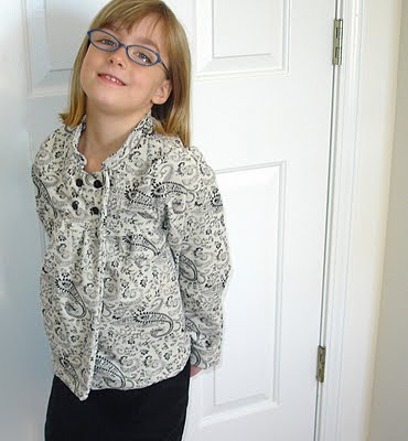
Black and white in a subtle combination (if there’s ever been such a thing as subtle black and white!) make a really elegant but age-appropriate Sunday Brunch Jacket and Skirt.
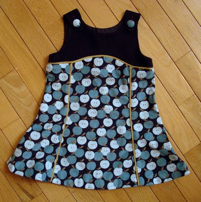
 This Tea Party Dress has more than two colors, but the color palette is tight: brown, gold and shades of blue. This qualifies as tonal in my book. I think this dress is fantastically successful and understated while remaining playful and interesting:
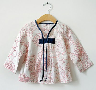
 Here is a 2 + 2 Blouse in a really wonderful red and white print from Valori Wells‘s Del Hi collection. I love how simple and clean this print looks.
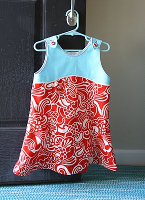
 Here is another two-color print with red and white. This Tea Party Sundress looks great with the addition of a third color, since it’s still clean and not overwhelming.
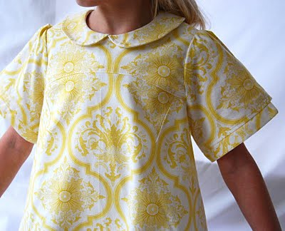
 Yellow and white looks fresh and exuberant, especially for spring and summer. This trendy jacquard-inspired print (another traditional print that’s been updated for today) on a Puppet Show Tunic looks clean and youthful while remaining subtle and not overwhelming.
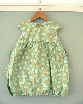
 I like the neutral, muted tones of the print on this Bubble Dress. These colors are great for winter or summer, I think.
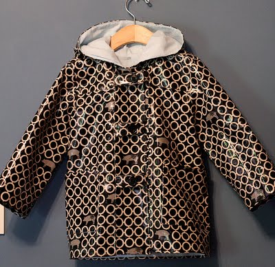
 And since the next (and last!) principle of fabric selection discusses juvenile prints, I thought it would be nice to include this tonal School Days Raincoat as a teaser. See the little pigs on the print? I love how subtle and whimsical they are.
I see you are saving the best for last – hehe!
I always wondered how I'd like the puppet show tunic using only one fabric, versus contrasting. I just never had the nerve to cut into anything, lol. I love it!
great post!
I especially LOVE the yellow and white puppet show tunic and the piggy rain coat*drool* I have that material only in aqua with ladybugs instead of pigs and its devine!
cant wait for your next post…
I agree, Liesl. I'm so over the riot of colour in a lot of handmade stuff. Less is more!
But then I miss the days before newspaper supplements were printed in full colour.
Instead, you often got line drawings or linocuts in black white and just one other colour. They do say that if an image doesn't work in black and white then it won't work in colour. It's a stretch but perhaps that could be loosely applied to clothes.
In my first painting class, our exercise was to paint using only black, white and one other colour. It really made us experiment with tone.
wow! Thanks for the tips! I love all the pictures you found! Such great inspiration!
Madeline