As a rule, most quilting fabric collections are comprised of a group of prints that are intended to work together. There is a formula to assembling a collection like this, and most groups work around one central print that holds the collection together. That print is usually larger in scale than the others, has more colors, and sets the tone for the group. As a result, the central print is often the print that attracts people to a collection.
That central print is also the one I tend to avoid when I’m selecting fabrics to make Oliver + S garments.
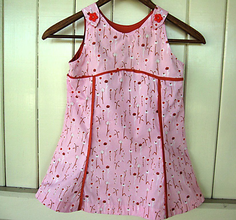
 Isn’t this Birthday Party Dress elegantly understated? I have no idea who designed these fabrics (I don’t recall ever seeing them before), and that’s one of the things that makes the dress work so well. I like it that I’m not able to identify the prints.
Why? Well, in part because it’s the most readily identifiable print. It’s the one that you’re most likely to see and think, “Oh, that’s a print by so-and-so.”
 This Tea Party Sundress is made from a Heather Ross print. But the print is one of the supporting prints from this collection, not the central print. I like the sweet, little flowers.
The central print is also often busier than the other prints in the collection, with more colors and a larger size. If you make a garment out of a central print, the finished piece of clothing can often be overwhelming–forcing people who see it to notice the dress before they notice the child. (So you can see that although these principles are separate, there is a lot of overlap between them.)
 This Tea Party Sundress, made by Spool in Philadelphia, was created from a supporting print in a Denyse Schmidt collection. I like how Spool has balanced the colors in the print with neutrals, adding in little pops of orange with the piping of the curved seam and with the buttons.
 I often find that the supporting prints in a collection–the prints that aren’t quite so bold, bright, and large in scale–are easier to work with and have a little more staying power. They don’t date as quickly or start to feel over-used as much as central prints do.
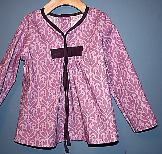 This 2+2 top serves as a great example of what you can do with a nice supporting print from a collection. It’s not overly bold and flashy. But the print’s tonal shades of purple make it work well as a shirt.
Notice in all the examples I’ve chosen to illustrate this post that there is plenty of color and a wide variety of style among these selections. A garment can embrace color–even bold colors–and different motifs as long as they don’t overwhelm the design or the person wearing it.
 This 2+2 top has been made in very bright yellow but in what’s obviously a supporting print from a collection. The small scale of the print balances the brightness of the color. I like how the tab and collar trim don’t match perfectly with the print. It lends some visual interest to the top.
For many of these garments, I can’t identify the designer of the fabric, which I think is a good thing. It’s not that fabric designers don’t deserve recognition and shouldn’t have a distinctive style. But when a garment is made from a very bold, large print in a signature style, chances are good that the child will get lost behind the clothing.
The top dress is made with a Neptune fabric by Tula Pink, the whole collection is lovely. This supporting print is tortise shell I believe. Great tips, btw.
That top dress with the greys from Tula Pink (must remember that name and check it out!) is lovely in its simplicity. Simple lines like yours and simple fabrics really make my heart sing – too many kid's clothes patterns out there feature the central pattern in a collection plus ruffles and frills for England, it's overwhelming and clownish on a small person.
These posts are so enjoyable and fascinating to read – it's like getting a glimpse of the Designer mentality and gleaning your experiential background.
Every once in a long while I fall in love with a central print and find I just have to make something out of it. That's when I go with the idea of less is better and use it as the skirt of a dress/skirt and either use a solid(more often this) or one of the complimentary prints in the group for the bodice/shirt. That way the bold pattern is not right up next to the childs face, taking away from their personality. It's that theory, "All things in moderation".
They are absolutely gorgeous. I am terrible at picking complimenting fabric so this really helps. Thanks for the pics and info. Now it makes me want to add the dress to my O+S collection!
Not sure if someone already pointed this out, but all of the fabric selection posts have used girls' clothing as examples. I think it's even harder to choose fabrics for boys' clothes, and would welcome a post on how to choose fabrics with style for boys. There's an even finer line to walk there.
Great tips & examples. thank you!
The very bright yellow in the 2+2 top is from Free Spirit Fabrics; Heather Bailey's Bijou collection: Tiled Primrose in canary. The darker trim is Tiled Primrose in brown. I'm using the canary in a project at the moment. It's beautiful fabric.
Spot on! As a designer of quilting and lifestyle fabrics myself I usually make my clothes from the complimentary designs and not my feature design of the range. This is where a main motive gets reused in a more subtle way and is often a better repeat pattern for making clothes.