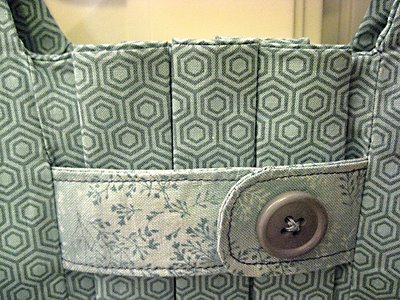
As a rule, most quilting fabric collections are comprised of a group of prints that are intended to work together. There is a formula to assembling a collection like this, and most groups work around one central print that holds the collection together. That print is usually larger in scale than the others, has more colors, and sets the tone for the group. As a result, the central print is often the print that attracts people to a collection.
That central print is also the one I tend to avoid when I’m selecting fabrics to make Oliver + S garments.
Why? Well, in part because it’s the most readily identifiable print. It’s the one that you’re most likely to see and think, “Oh, that’s a print by so-and-so.”
The central print is also often busier than the other prints in the collection, with more colors and a larger size. If you make a garment out of a central print, the finished piece of clothing can often be overwhelming–forcing people who see it to notice the dress before they notice the child. (So you can see that although these principles are separate, there is a lot of overlap between them.)
I often find that the supporting prints in a collection–the prints that aren’t quite so bold, bright, and large in scale–are easier to work with and have a little more staying power. They don’t date as quickly or start to feel over-used as much as central prints do.
Notice in all the examples I’ve chosen to illustrate this post that there is plenty of color and a wide variety of style among these selections. A garment can embrace color–even bold colors–and different motifs as long as they don’t overwhelm the design or the person wearing it.
For many of these garments, I can’t identify the designer of the fabric, which I think is a good thing. It’s not that fabric designers don’t deserve recognition and shouldn’t have a distinctive style. But when a garment is made from a very bold, large print in a signature style, chances are good that the child will get lost behind the clothing.

